«always go to extrem!»
(it’s easy to make some step backs)
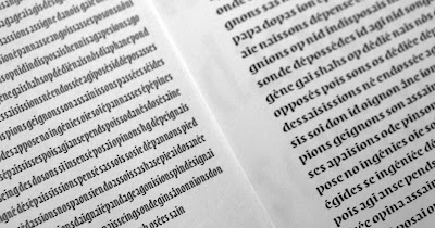
Last week Gerard Unger was visiting the department for the first time. He came with a new Unger Method: a dense 4 days work session, experimenting with the design of a very condensed typeface. First sketches, never condensed enough.
 I explored five direction by sketching, reducing, reducing again, reducing more, composing words and going back to sketch. Then the experiment keeps going on FontLab with digitalised forms and printouts.
 Picture by Dan ‘TypeOff’ Reynolds.
The use of computer allowed us to to explore the automatic extansion of typeforms as a design process. We all made some really surprising and exiting statements about the realtion of body size, x-height, wideness and optical sizes. The following pictures show some tex set with exactly same body and x-height !

Thanks to Gerard I learned a lot, both from my own design and those of my classmates!
Dan Reynolds and Paul Hunt made some more detailled ‘english native speaking’ reports on their own blog.
Tuesday, 30 October 2007
First Unger Week
Subscribe to:
Post Comments (Atom)

6 comments:
Your second image in this post is really fantastic! Such experimentalism and dexterity at the same time. Paul is right—you should get these to Myfonts soon ;-)
waouh!!!! elle est trop belle ta typo mon amour!
excellent ! je souscrit au Reading par correspondance grâce tes posts !
Pourquoi j'ai pas les photos/images moi? deja que je parle pas anglais...
Elles passent pas la douane tes images... On ne les voit pas en France. :/
Bouhouhou !
Hop là les images sont revenues ! Désolé pour ce petit problème technique.
Post a Comment